Mapping
Justice Map Released!
Submitted by akreider on Tue, 06/03/2014 - 20:56.Justice Map is finished and ready for public use!
Features include
-Block level resolution of race. You can zoom in as far as you want. No other website lets you do this on census data.
-100 GB+ of generated image tiles. My computer spent days generating and processing image tiles just for you!
-Save as Image. You can save the map as an image or a high-resolution image.
-Drawing tools. You can add a marker, polygon, line, or circle to the map and save it.
Justice Map - West Philadelphia
Submitted by akreider on Thu, 01/02/2014 - 22:29.A map of percent black in West Philadelphia from JusticeMap.org.
Block level resolution.

Justice Map in development
Submitted by akreider on Tue, 10/08/2013 - 22:22.You can see my early version of Justice Map.
This is for demonstrating what the layers look like, getting feedback on those, and not anything close to what it will look like when it is finished.
It is a set of open map layers based on the 2010 Census and 2011 American Community Survey for race and income. I put census tracts up online, but I plan to add counties (for both) and block groups and blocks (for race) in the near future.
US Household Income by Census Tract
Submitted by akreider on Thu, 06/27/2013 - 22:48.I'm working on a project to create open map layers for the United States for race and income at a high resolution. I want to create a system that encourages people who have limited to zero GIS (Geographical Information Systems) experience to create maps for their community!
So I've been messing around with TileMill, PostGIS, and the Census data. TileMill is an amazing program that makes it easy to make a map. They've got nice styling, great support, and you can publish it online for free (if you have limited traffic).
This is a map of household income in the US by census tract. There are 70,000 census tracts in the US.
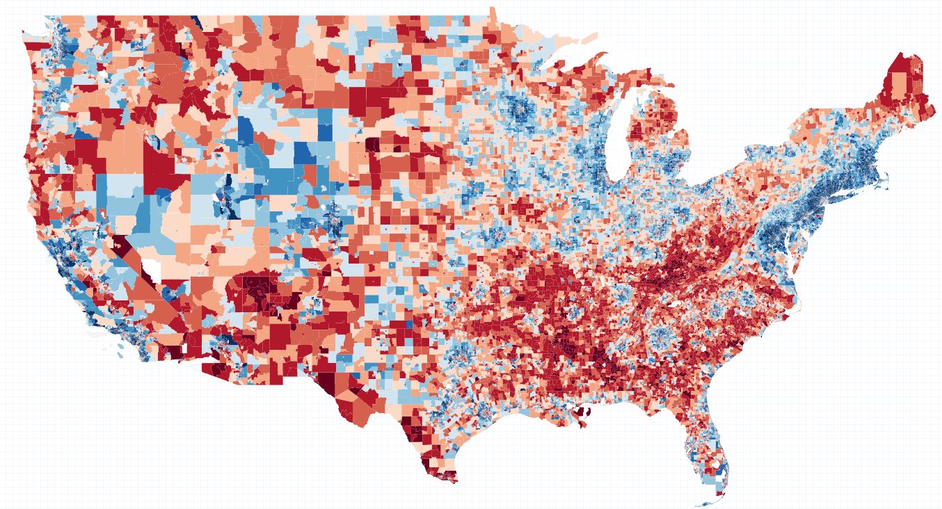
Legend: red is below average income, and blue is above. I divided the data into ten quartiles.
Policy Map - Unemployment Rate Map, Widgets, and More
Submitted by akreider on Tue, 06/04/2013 - 17:22.Policy Map is an interesting website. They have some maps that are widgets - so you can copy and paste the html into your website. For instance this is a map of unemployment in the US by county:
Light Pollution Map - Where to See the Aurora Borealis
Submitted by akreider on Thu, 07/12/2012 - 23:17.This is a cool google map of light pollution.
Mapping the Death Penalty
Submitted by akreider on Wed, 05/23/2012 - 15:00.This map does a good job of showing the types of countries that use the death penalty and those that don't.

Broadband Map for the United States
Submitted by akreider on Tue, 05/15/2012 - 21:27.The National Broadband Map has some neat maps. For instance the speed test one shows that real speeds are slower than advertised ones in my area (but surprisingly in some areas they are actually slower than real speed).
Changing Racial Demographics on Your Block: A Map
Submitted by akreider on Wed, 01/11/2012 - 18:25.There is an amazing website Urban Research Maps that lets you see how racial demographics have changed on a block level over the past ten years - between the 2000 and 2010 census.
It has data for only part of the United States, but this data includes PA, NY and several other major states.
My neighborhood in 2000

ArcGis Online - Neat Maps
Submitted by akreider on Mon, 07/04/2011 - 14:34.ArcGis Online has some neat maps like
this one which fits Americans into nice marketing categories. You can zoom in to the block group level (Census data category) and get detailed information about your community!
- Login to post comments